Ameliorate Update 1/6/26: Summarizing, Nonprofit-izing, Communitizing
TLDR
- Looking at starting a nonprofit for Ameliorate
- Added a mobile-friendly summary view (see demo !)
- Misc features & quality-of-life enhancements
- Next: diagram visualization & navigation features, gauging interest, expanding broader collaborative reasoning community
Happy New Year everyone, and welcome to a fresh round of Ameliorate updates! 🙂
We’ve got some updates about potential nonprofit-hood, expanding the community, and some more features. This time I’ve put the feature changes as more of an appendix at the bottom, since that section is a bit long.
What I’ve been doing
Nonprofit Stuff
The big non-code update is that I’ve been looking into creating a nonprofit for Ameliorate! I want to open up more financial possibilities (mainly grants or philanthropy) that align with Ameliorate’s for-social-benefit goals. I’ve spent a lot of time learning about how nonprofits work, what is all required in terms of forms and responsibilities, and seeing what kind of support is out there.
It’s hard to say if this has been the best use of my time, but at the very least I feel like I’ve gained useful knowledge for running a project with a bit more structure. It has also been a great excuse for figuring out better ways to pitch Ameliorate, describe its goals, and think about what an actual business plan might look like!
There’s still work to do before Ameliorate will be a great candidate for e.g. grants, like better-demonstrating Ameliorate’s value, and establishing some traction in terms of usage and support. But I’ve got the paperwork ready and will be starting the nonprofit application process soon!
Broader community stuff
In the past couple months, I’ve had several meetings to discuss various ideas for how tooling can help people think through problems together.
It’s been great to have so much discussion on this, and to find more people with overlapping goals! A couple of us even worked together to test out some capabilities of LLMs for collaborative reasoning tools (we made a document for the tests we ran and want to run ).
One thing I’m pretty excited about is that we’re cooking up plans to expand a broader collaborative reasoning community, in cahoots with the Canonical Debate Lab community . Stay tuned 👀.
What’s next?
I expect the majority of my time to be split between adding a few more diagram visualization & navigation features (check out the backlog ), as well as gauging interest for Ameliorate by reaching out to more communities and groups. If you have ideas for people who might be interested in trying out Ameliorate, let me know!
I’ll also be continuing efforts to establish the nonprofit, and, as mentioned, expanding a broader collaborative reasoning community.
Read below if you’re interested in seeing a bunch of features that have been added since last time. Thanks for tuning in!
Cheers 🙂
Understand ourselves. Understand each other. Grow together.
Ameliorate.
App updates
There have been a decent number of changes to the app since last post. If you prefer to watch the latest updates rather than read, check out the demo video .
Summary view
It might be annoying to use the diagram, particularly if you’re on mobile and you don’t navigate diagrams often. Now there’s a summary view, which attempts to summarize what you might care about for a topic or a specific node:
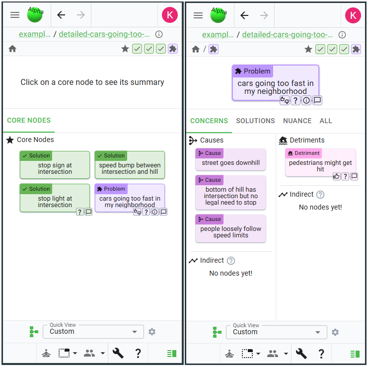
If you have no node selected (left image), the view will show the topic’s core nodes. Right now, these are just the topic’s Problems and Solutions, but later you’ll be able to choose these.
If you do have a node selected (right image), the view will show different things you might care about. Each node type is a little different: for example, a Problem has Concerns, Solutions, and Nuance; whereas a Solution has Components, Tradeoffs, and Nuance (justification and research).
Feel free to explore this new view yourself via this topic for cars-going-too-fast . Note: it’s a little annoying to get to from the diagram, and I realized it has a decent amount of overlap with the details pane, so it’s very likely that I combine the details and summary views .
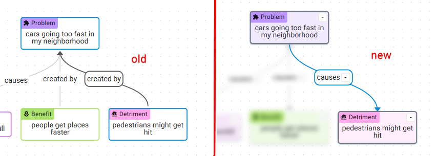
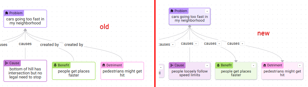
As an aside, the summary view required some annoying graph traversal logic which would also be needed for the next feature I want to do , so I did a refactor (which took a lot longer than I wanted 😅) to make the logic less annoying. The visual difference is that now there’s a more consistent set of labels for the edges, e.g. “causes” instead of “caused by”, “causes” instead of “creates”:
Misc features
Many different miscellaneous and quality-of-life features have been added since last time, here are a few to highlight.
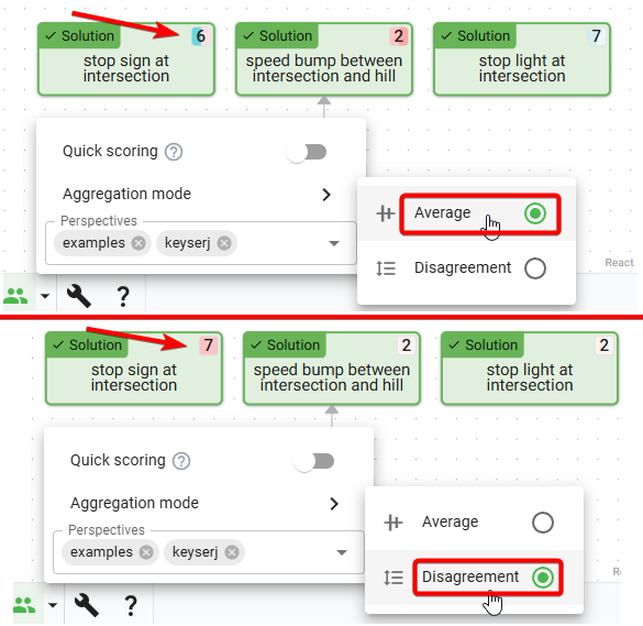
Disagreement scoring
During discourse sessions , it seems to happen somewhat often where we each score nodes, and want to see where we disagree. The score pie colors are sometimes easy enough to scan, but it’s harder when there are a lot of scores. So a disagreement calculation has been added, which you can use by just looking for the highest number to see where you disagree most:
Hidden neighbor pie
Sometimes it’s hard to tell where there are hidden nodes in the diagram, to know where there’s more to explore. Previously, there was a little blue indicator, but didn’t give much information. Now there’s a hidden neighbor pie which shows the number of neighboring nodes that are hidden, and is colored based on the hidden node types:
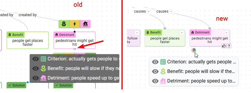
This is a bit experimental; I think it’s slightly too distracting, and it looks a bit similar to scores. I’ll be keeping an eye out for better designs for this kind of thing.
Adjusted add-node buttons
To add new nodes, you previously needed to know which direction the nodes would be added in (above or below the current node), and was harder to tell what nodes could be added, because only the node icons would show. Now there’s just one add button that all the node types are added from, and there’s text describing what will be added:
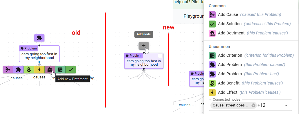
You’ll also notice that there’s a Connected Nodes multi-select at the bottom of the new add-node menu - you can use this to add or remove relations from this node to another node. This was mainly added as a convenience when you want to connect two nodes that are far apart in the diagram.
Quality-of-life improvements
Better node styles
Nodes now have new life breathed into them! Inspired by a community suggestion, a node’s background is now slightly colored. I think this gives them a slightly modern look. You may have noticed from the earlier pictures, but here’s another one just in case:
Viewport animations
Some viewport movement has been added just to make things feel a little smoother. You can now paste a URL to view a specific node, and the viewport will zoom to show that node:
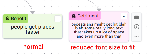
Node text resizing
Previously, it was pretty annoying if the text you wanted didn’t fit inside a node - you’d have to scroll a tiny scrollbar to see the text! Now text automatically shrinks to fit:
That’s all the updates for this round! See you next time.