Ameliorate Update 12/12/24: Reducing Clutter
Ameliorate is a tool for analyzing problems effectively, collaboratively, and with an open mind.
TLDR
- Got a lot of great feedback, trying to make the app more new-user-friendly
- Reduced interface clutter, various misc improvements (see the demo video )
- Check out the new Ameliorate intro video
- Next: try a few things to make the interface more intuitive, and do some socializing of the tool
Hey everyone! Welcome to another edition of Ameliorate updates 🙂.
What I’ve been doing
I started off this last couple months socializing the tool, and have gotten a lot of good feedback! You can check out (and join!) some of the discussions across the various GitHub issues , as well as at the recently-created GitHub Discussions .
I put a bit of a pause on further socializing to think about (and discuss) how to make the tool more intuitive and easier to use, particularly without having to rely as much on the tutorials and documentation. Some of the improvements in this update are for reducing clutter in diagrams (kind of a first step in improving the intuitiveness), and some of the improvements are a bit miscellaneous. There are more interface-improvement designs in the works!
Also: I made a new intro video ! I felt that the old one was way out of date (to the point of being misleading). You may have already seen this if you follow Ameliorate’s Facebook , YouTube , or Discord .
App Updates
If you’d like to see these in a demo video, check it out here: Ameliorate Update Demo: Reducing Clutter .
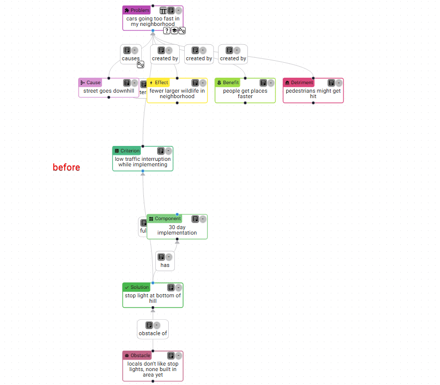
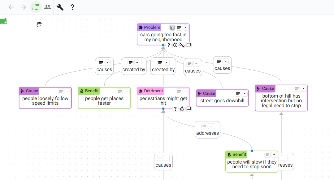
More consistent colors for nodes
Previously, there were some significant differences in brightness and saturation between the node colors, and that was kind of annoying (e.g. Effect was really bright, Problem/Detriment were really dark and saturated). I’ve made the colors more consistent in terms of brightness and saturation! Note: I’m sure the colors could still be improved, let me know if you have any ideas.
Here’s the before and after:
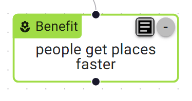
Defaulting indicators off
One piece of feedback that was pretty useful was that indicators add a bit of clutter, and new users don’t know what they mean right off the bat anyway. So I’ve defaulted indicators to off, and added an easy button for showing them.
Honestly I was surprised at how much cleaner it looks with indicators off! It’s even more noticeable when there are more nodes in a diagram too.
Indicators stand out less
Along the same vein, when the indicators are showing, they now stand out a little less. Light gray backgrounds if they’re indicating something, white backgrounds if not, and node handles are hidden unless you’re hovering or selecting a node:
Avoiding edge label overlap
One thing that contributes to the feeling of clutter is that edge labels are sometimes hidden behind other ones, or behind nodes. I set off to have labels avoid being hidden, and added an option (in the More Actions Drawer) to make this happen:
I really wanted to make this the default, but unfortunately there are two issues with avoiding overlap:
- the layout is affected, and often extra layers of nodes are unnecessarily created (making the diagram more spread out)
- the edges often connect two nodes at awkward angles (rather than matching the up/down flow of the diagram)
Sometimes avoiding the overlap is worth these issues, but I think often it isn’t. These issues could be addressed with more effort, but I didn’t want to spend more time on it.
”View context in diagram” button
I was building a somewhat-large diagram (open-source-vs-closed ) with many pieces (Components & Effects) of the possible Solutions, and a Criteria Table to help evaluate the tradeoffs of all of these, but I didn’t have an easy way to see which Solution pieces that were relevant to the Criteria. So I added a button to the “fulfills” edge that sets filters to show only the one Solution’s pieces that are relevant for one Criterion:
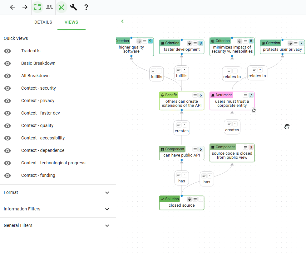
There’s also one of these on Solution nodes, to show all the pieces of that Solution, and on Criterion nodes too, to show all the Solution pieces connected to it from any Solution.
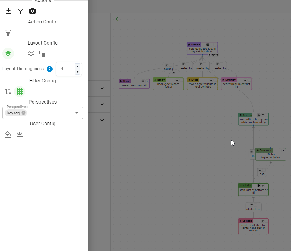
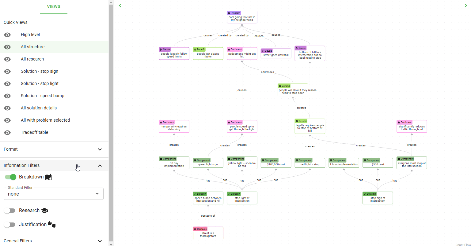
”layers from core nodes” filter option
I noticed that, when trying to creating a high level view for a diagram, some diagrams prefer to show a different number of layers, based on how wide and deep the diagram goes. So I added a “layers deep” option to the High Level standard filter, that can easily adjust this. The High Level filter now shows all core nodes (Problems and Solutions) with X layers of neighbors from them:
What’s next?
For the next couple months, I plan to focus on making the interface a little more intuitive, and to resume socializing the tool. If you know of anyone or any groups that may be interested in Ameliorate, or if you’d like to discuss how to use it for a problem you’re working at, don’t hesitate to reach out ! And as always, you can check out the top of the backlog to see more specific details about what’s coming up.
See you in a couple months!
Cheers 🙂
Understand ourselves. Understand each other. Grow together.
Ameliorate.